
October 26th, 2021
3 Ways to Improve Tableau Dashboard Interactiveness Using Parameter Actions
Parameter Actions is one of the many exciting features Tableau has introduced in recent months. It enables you to change a parameter value through direct interaction with your chart.
Here are the 3 different ways of implementing parameter actions in your Tableau dashboards.
Dynamic Date Parts
With parameter actions, we can control multiple data sets. Using a control sheet and the Superstore data set, this tutorial will show you how you can create dynamic date parts.
Let’s jump to the steps now.
- In Tableau, connect to the Superstore Sample data Source.
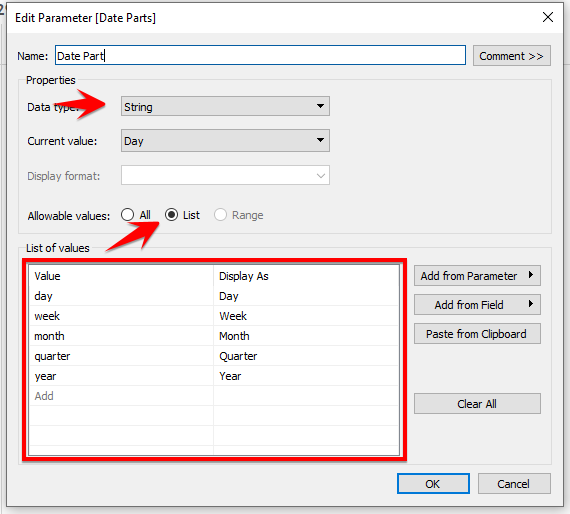
- Create a parameter as shown in the screenshot below. Ensure the list values are in small letters but you can change the display name for your convenience.
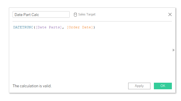
- Open the calculation window and enter the calculation below.
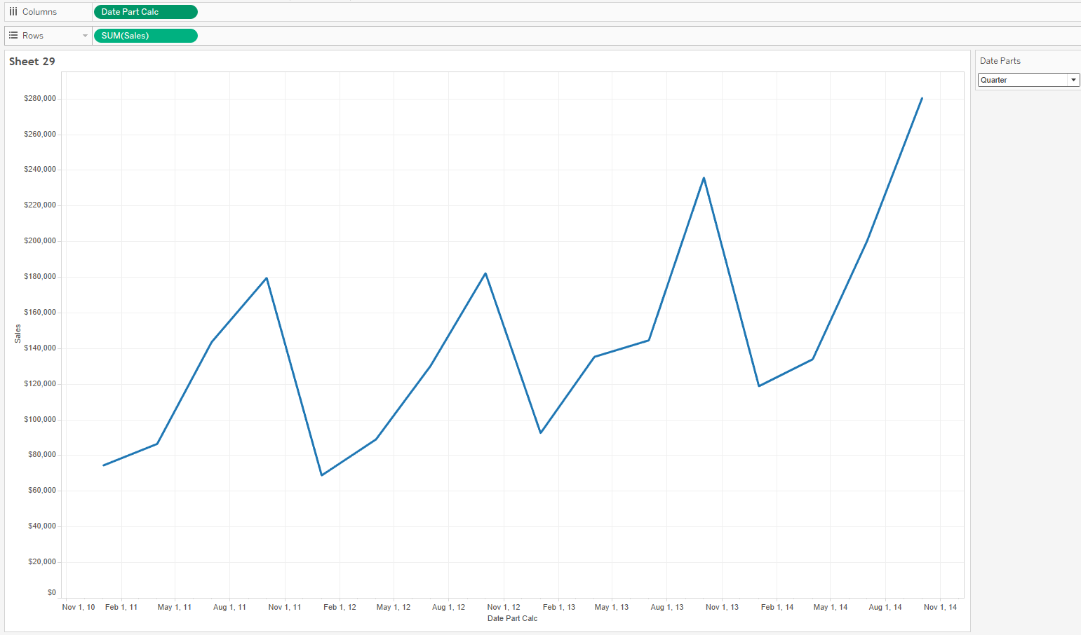
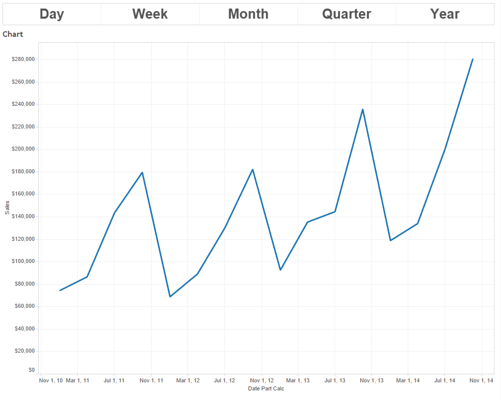
- Now test if the calculation created in previous step works by, dragging the Date Part Calc to Columns and the Sales to Rows. Show the parameter control and cycle through the various date parts. Name this chart Line Chart.
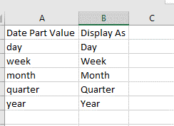
 Now that we’ve done with testing the Date Part Calc, we need to create a similar list from our parameter in Excel as shown below.
- Bring this new Excel sheet into Tableau.
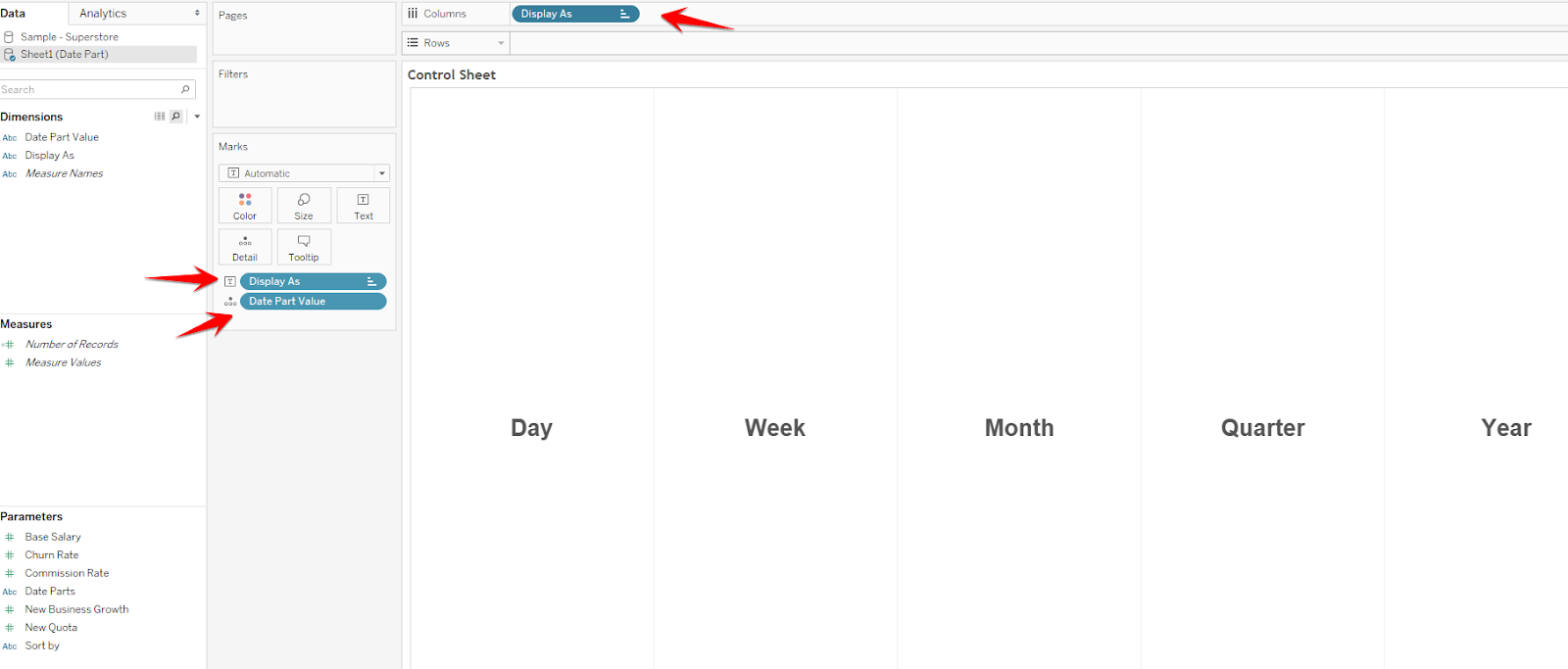
- Using this new data source, create a sheet as shown below using the Display As column and Date Part Value. Name this chart Control Sheet.
- Create a new dashboard and place both sheets on the dashboard.
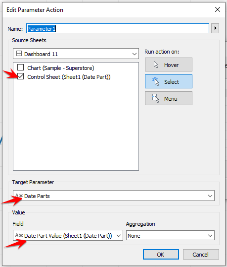
- Select Dashboard > Actions > Add Action > Change Parameter.
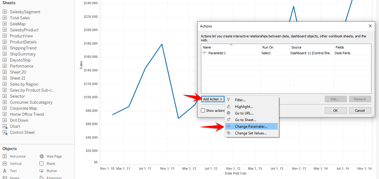
- In the Parameter Action menu select the options as shown below.
 On your dashboard, click through the date parts to see the changes in the chart.
Dynamic Reference Lines
Parameter actions are a useful way to make your reference lines dynamic. With this feature, you can dynamically update your reference lines without using a calculation.
Let’s take a look at the steps to get this done in a Tableau Dashboard.
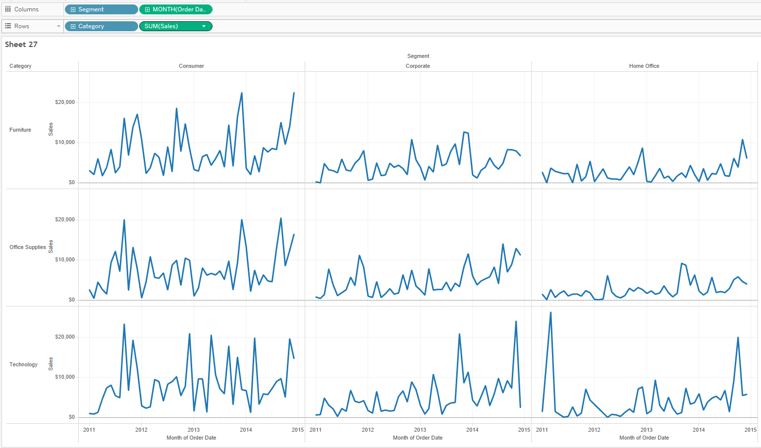
- Using your Superstore data set, build a view that shows the trend of Sales based on Segment and Category as shown below.
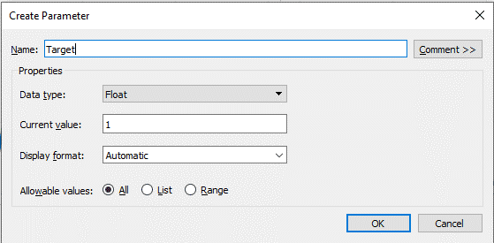
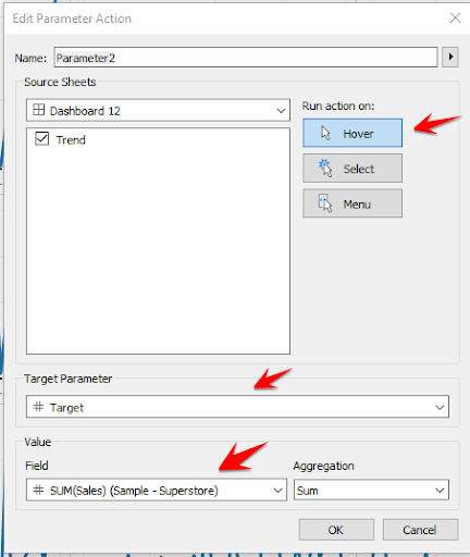
- Create a parameter as shown in the screenshot below. Name this as Target.
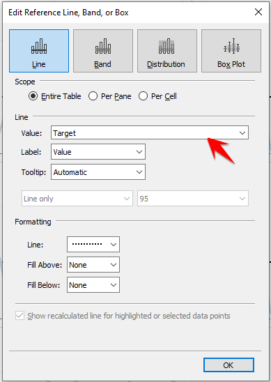
- Right-click the Sales axis and add a reference line. In the reference line window select the Target parameter as your value as shown in the screenshot below.
- Create a dashboard and bring your chart to it. Select Dashboard > Actions > Add Action > Change Parameter.
- In the Parameter Action window select the options as shown in the screenshot below.
- Now hover on your trend line to see the reference line update the parameter value. This is a useful way to see the reference line in context with the other categories in our chart.
Displaying summary data
Another interesting way to use Parameter Actions is to summarize a subset of the data. In the next example, we will learn how to use Parameter Actions to show the Average profit based on a selection we make in our chart.
Let’s go through the steps.
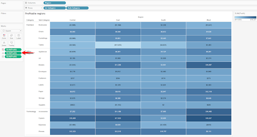
- From your superstore dataset, build a highlight table using Region, Category and Sub-category fields as shown. The metric should be placed on the details shelf.
- Build a scatter plot using Sales and Profit. Place Category, Sub-category on the detail shelf and Region on color.
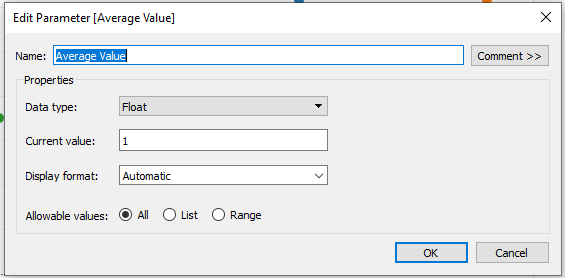
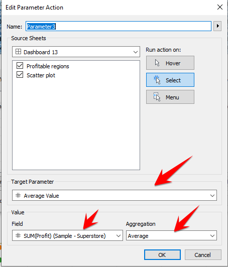
- Create a parameter and label it Average Value as shown below.
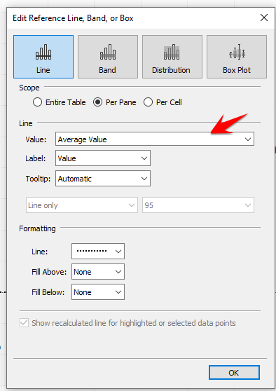
- On your scatter plot view, add a reference line using the Average Value parameter you just built.
- Create a new dashboard and bring the two charts you built to the dashboard.
- From the menu, select Dashboard > Actions > Add Action > Change Parameter.
- Select the options as shown below and hit OK.
- Select Dashboard > Actions > Add Action > Highlight and select the options shown below to highlight marks in the scatter plot.
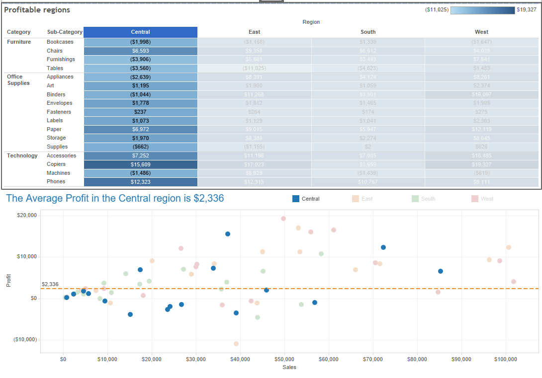
- Click through the Region, Category and Sub-Category in your highlight table to see the reference line update to show you the Average Profit. Additionally, you can select marks in your scatter plot to see the Average Profit value update.
Subscribe to BI Connector blog to learn more on Tableau tips and tricks. Want to visualize OBIEE data in Tableau? Try BI Connector for Tableau free!